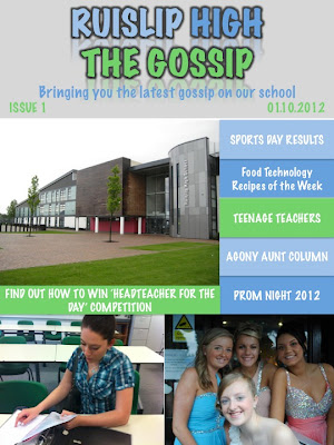
This is my magazine plan, it is slightly different to my template as I felt whilst designing this magazine to make slight alterations to make it look more eye-catching and interesting. The colours are bright and go with the school logo. By having three pictures on the cover make the magazine look eye-catching for the audience.


No comments:
Post a Comment