This is one of the photos I will use in my magazine. I like the style of this shot and how they have quite a serious look on their face which should intrigue my target audience as to why they are styled in this way. They look like quite a close-together girl band as they have a similar sense of style and their makeup makes them look like a young teenage girl group. This is a long-shot because I wanted to get in their whole outfit to show the audience as girls especially are often interested in what the celebrities are wearing and will often imitate their style.
This photo was taken in the photo shoot too, they are wearing the same clothes as the previous shot, but this time are three of them. The shot type is a close-up but not an extreme close-up, this is to show their facial expressions and hair/makeup style. I will use this for an article of a girl band who have recently lost a member of their band, and will write an article below this picture.
I really like this photo, because it shows the whole length of the model used in the photo shoot I carried out for my magazine. The shot type shows off her sense of style and long hair, with a happy facial expression. This will be used on my contents page because I feel that this image will capture the audiences' attention to continue reading the magazine. I will of course edit the photo so that her hair isn't 'flyaway' and to take away any marks on her skin. I will also edit the background colour to a lighter white, which should make her stand out more.
I especially like this photo because it portrays a 'rock/pop chick' look. I really like the style of the shot and how her is blowing and the way in which she is stood with the electric guitar at a small slant to show her outfit. I will edit the background of this photo because you are able to see the creases in the white backdrop on the floor which does not look professional.
Showing posts with label Planning. Show all posts
Monday, 3 December 2012
Sunday, 2 December 2012
3 of 4 photos for music magazine
Here are some of the possible images I may include in my media product.
These are just 3 of my 4 photos I took myself that I will be using for my music magazine 'LOUD'.
I will be editing these 3 photos on Adobe Photoshop to get erase flyaway hair, lines on the forehead, and to slightly blemish the girls skin. I want to make the photos look as professional as possible just like a real magazine.
I will use this photo on my front cover in small or on the contents page. However, I will get rid of the blowing bits of had and make the photo slightly lighter.
I will most probably be using this photo for my front cover as it really stands out and shows that it is a music magazine because of the guitar as it comes across to the audience as a 'rebel-ish' photo.
I think the hair blowing looks quite effective, however the clothing is quite dark therefore I will edit the photo so that it is slightly lighter and I will also get rid of the creases on the white backdrop floor.
I will upload a few more photos to my blog that I will also possibly be using in my magazine.
Friday, 30 November 2012
Monday, 26 November 2012
Indesign Practise

I practised using Indesign today to help me get used to using it for when I come to make my music magazine. I took some pictures from the internet and used them for the practise magazine cover.
My magazine should be a music magazine but just for practise today I created a celebrity gossip magazine but used my own made-up title 'LOUD!' which will be the name for my music magazine.
The large image that is used as the background/cover of the magazine is Kendall Jenner. The left image is Olly Murs and the right image is Robert Pattinson.
The two images of Robert and Olly have sharp edges so next time I practise on Indesign I will take away the sharp edges to blend in with the background as these edges can make the magazine look quite unprofessional.
When I do come to make my magazine I will use bright colours and fill the whole front cover so that it doesn't look to empty. When I take my own photos I will take a similar shot to the one of Kendall Jenner as I think it looks quite eye catching. I will also design my own barcode.
Sunday, 25 November 2012
Practise Photos
These two images are photos I took myself for my music magazine. These were only practise photos just so I could get the hang of using the camera and practising different camera angles and lighting etc.
I will be taking photos again on Tuesday that I will use in my magazine. I will then use Photoshop to make the images look more professional for a magazine.
Sunday, 18 November 2012
Double page spread magazine essay
The We Love Pop magazine is
mainly for teenage girls because it is a bright and colourful magazine full of
recent celebrity singers and bands. The Q Magazine is mainly for older men/late
teens who are interested in rock music, which is easily noticeable on the
magazine double page spread because it has an image of three men with tattoos
and long hair, drinking beer which would often signify a rock/heavy metal type
band which is stereotypical.
The
first magazine ‘We Love Pop’ layout is quite full of images, text, quotes and
colour. The main colours used on the spread is light blue, pink and yellow
which is quite girly and eye catching for the target audience. There a lots of
quotes over the page which are really trying to grab the audiences’ attention
that they will read the interview underneath. This is used a lot in We Love Pop
magazine as there a many quotes in big, bold writing that have eye
catching quotes from the interview for example ‘PEOPLE ARE SO JUDGEMENTAL’ in
bright, white, bold font with a large blue box which to pop music fans would be
very eye catching. However Q Magazine used only one quote ‘Just a vodka please’
this quote may attract the audience but the font is hardly noticeable as it is
in quite similar font just slightly bigger than the interview font therefore
some people may not be interested even if they are rock music fans because the
font is not eye catching it does not seem important.
The pictures used on the
'We love pop!' page double page spread are quite similar as the story used on
the pages focus a lot on Tulisa (pop music star) all of the pictures are either
of just herself, or with her and another celebrity singer. This has most
probably been done to remind the reader of the magazine what the main story is
about and to attract them to the celebrity figures. A variety of posed
individual shots and group pictures have been used on the magazine double page
spread for varied effect, however the bigger pictures are the of just Tulisa
alone, which are long body shots. The smaller pictures have been used to
support some parts of the conversation. For example, Tulisa is asked whether
she knows a member of One Direction, Harry Styles, and in the middle of the
paragraph a picture of them both has been placed for entertainment purposes and
to back up the story which is bound to attract pop music lovers especially
because One Direction are loved by many females.
However, the Q Magazine double
page spread pictures are slightly different. The only picture on the spread is
the a large image on the back which takes up the whole of the page which could
mean it is important and really wanting to grab attention. The picture is of
three male singers, who look like they are having a party, as the picture
contains empty bottles of alcohol everywhere, they also have no tshirts on and
there is a lot of mess as if a party has just ended. On the bottom right hand
corner of the picture, the words 'having a quiet night in’, this is clearly sarcasm
and would amuse the audience because they would be intrigued to know what the
story is about.
The last feature on these
two double page spreads is the layout of the magazines. The 'We Love Pop!'
double page spread seems to be set out a lot like a newspaper article. The headline along the top and a smaller
font telling us more information on the story, below the headline, a picture is
in the middle of the circle of text and the layout of this page makes the
picture really stand out which is the most important part of the page as this is
what attracts the audience, and suggests the text links to what the message of
the picture is. Below the image shows a quote from the text, again hinting
parts of the story to make the reader intrigued to read it. The second page is
a large image of Tulisa using the whole page which could mean the story to this
image is important, as smaller images may not be as important hence why they
are small.
In the Q Magazine double page spread, the layout
is very basic. There are no images on the first page and the text is set out
again like a newspaper article as it contains very basic font style and size
with little colour. The text is written in 2 columns and takes up a big amount
of the page. Much like the 'We Love Pop!' first page. The main headline 'Biffy
Clyro' is central along the top, with smaller font below it is explaining more
about the article. The text layout has been set out with interview names, with
the speech next to the celebrities initials and the question they are being
asked above it.
From studying both completely different magazines I
have found that a magazine with more colour, exciting font, lots of images and
eye catching quotes attracts the audience much more than a magazine with basic
colour, simple font and very few images. Therefore I know that when creating my
magazine that I need to use lots of eye catching features that will really
attract my target audience.
Publication Plan
Name of magazine: LOUD
Font of name: HOBOSTD
Positioning statement: Britain's favourite pop music magazine
Frequency of publication: Weekly
Price: £1.50
Rationale: To produce an up to date pop music magazine that attracts all young people (females) who enjoy the latest singers gossip.
Style: Pink and black
Thursday, 15 November 2012
Images I would like in my magazine
Here are some images I found from the internet that I would like to include in my magazine, the photos I take I will try to style the models in a similar way.
I also really like this image of model Kendall Jenner. I like the way in which she is posing, along with her hairstyle and choice of clothing. I think this style of image would stand out on the front cover of my magazine, therefore I will attempt to style the model for my photo-shoot in a similar way.
I really like the style of this image of country/pop singer Taylor Swift. I like the close-up as it shows her hair-style and makeup. I think this style of image would stand out on my music magazine.
I also really like this image of model Kendall Jenner. I like the way in which she is posing, along with her hairstyle and choice of clothing. I think this style of image would stand out on the front cover of my magazine, therefore I will attempt to style the model for my photo-shoot in a similar way.
I really like this image of girl band Little Mix. I like the way are standing, their similar choice of clothing (black skirts) and their facial expressions. They really look like a close-together girl group who would attract a similar target audience to the one for my music magazine.
Monday, 12 November 2012
Double page spread magazine
I analysed and completed an essay about the differences between the following magazines. I wanted to get a good undertanding of how both magazines presented images, text, colour etc to help me produce a good music magazine that is very eye catching for my target audience.
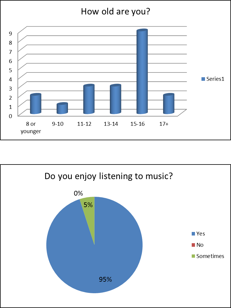
Results from my questionnaire
The results from my questionnaire will now help me to plan my music magazine. From the results I have been able to view roughly what kind of music my target audiences' age group enjoy, the price they are willing to pay along with roughly how often they buy music magazines or listen to music.
I have now been able to work out what sort of images I will include in the magazine, the genre of music I will base the music magazine on and the age group I will target at. I will use specific images, colour and font that I think will best suit this target audience. I will also conduct a number of drafts for the magazine and will improve and add to it as I go along. The final media product should look the most professional out of all of the previous drafts, it should also suit my target audience perfectly.
Questionnaire Analysis
I wanted to find out the age of the respondents so that when they answer the other questions e.g. 'What kind of music do you like?' I can discover if there is a link between age and the genre of music they like.
I asked this question so that I can get a good idea of what age groups enjoy listening to music so that I could design my music magazine for their age group.
Music Questionnaire
This is my music magazine that I handed out to my target audience 8-16. I got 20 questionnaires filled out to collect as much information as I could about what magazines this age group like.
Sunday, 11 November 2012
Analysing Contents Pages
I looked at four different
magazine contents pages and analysed each one. The magazine contents pages I
analysed were ‘Mix mag’, ‘we love pop’ ‘Q magazines’ and ‘NME’. Each magazine
share some similar features, however they all both differ in their own unique way.
The first magazine contents page that
I analysed was Mixmag. This magazine is a dance/music magazine. The target
audience would be young adults up to the age of around 30 who enjoy club/dance
music. The contents page does not contain much language as the majority of the
page is filled with big images. This could be because a lot of people enjoy
just looking at the pictures rather than reading lots on a magazine. However,
at the bottom of the first page of the double page spread; it contains the
words ‘your free CD’. This is informing the reader on the artist of the CD and
the songs that are included. Where the page numbers are, are the title of the
article and underneath is a brief summary of each story included inside the
magazine.
<!--[if !supportLineBreakNewLine]-->
<!--[endif]-->
<!--[if !supportLineBreakNewLine]-->
<!--[endif]-->
This is similar to the NME (New
Music Express) magazine. On this contents page of the magazine, there are 8 images
that all vary in size. The text on the page are all quotes that come from the
stories inside the magazine. For example, on page number 6, under the picture
of a musician playing the guitar, the quote is ‘Someone’s gonna have to go to
the hospital’ this is in capital letters which suggests it is an important
quote or story in the article. Under the quote, there is smaller but bold font,
which says “Howler visits everywhere on
the NME tour.” Both magazines also
state the page numbers on the bottom of the pictures and the contents and page
numbers are not the main part of the magazine, the pictures are the most
important as it can tell the audience a lot just by glancing at it.
Another magazine contents page I analysed
was ‘We love pop’. The main target audience would be teenage girls who enjoy
listening to pop music. The pictures on this page are varied; there are 6 main
pictures. The biggest picture in the middle is of a pop artist Tulisa, which
could mean that she is quite famous and popular in pop music, therefore this
would persuade the target audience to buy this magazine. Also on the magazine
is a strip of 11 little images along the bottom, which are previews of posters
that are included inside the magazine. All the pictures are of pop artists,
which is relevant to the target audience.
‘Q magazine’ also has pictures on
their contents page that are similar to ‘We love pop’. The images are all of
musicians; there is one main picture on the right hand side of Adam Ant, which
is similar to the main picture of the pop singer Tulisa on ‘We love pop’
magazine. The layout of the contents page is a block containing the title
‘Inside this month…’ along with 10 stories being shown with their page numbers.
This layout is similar to ‘Q magazine’ as this contents page also has a box with
the words ‘REGULARS’ with a few stories mentioned along with their page
numbers. The layout of both magazines are similar because the contents pages
are in number order. This has been made so that it is easier and less confusing
for the reader.
One other magazine I analysed was
‘We love pop!’ This was the one of six magazines that had their own logo. Their
logo was ‘WE ♥ POP!’
and is situated on the top right of the page next to the title. The rest of the
magazine contents pages have the name of the magazine (Mixmag) along the top,
such as ‘CONTENTS’ on Q magazine or ‘Inside this week’ for NME magazine. Fonts
are also varied on some of the magazine contents pages. NME magazine font is
different for each story that is briefly mentioned on the contents page. This
could be to not make it look simple, but to also give an impression that there
is a reason for the font to be different for each story and to make it look
more interesting and attractive to the target audience.
Once I begin to create and
develop my own music magazine cover and contents page, I will use the magazines
I have analysed to get a gain a good understanding of other magazines layout,
colour, images and use of language and text. I will also use this analysis of
the magazines to see which features looked better than others and which ones could
be improved so that I can use this to help me create my magazine so that it is
eye-catching and attractive for my particular target audience. I need to gather
plenty of research so that I design the music magazine to suit the age of my
target audience.
Monday, 5 November 2012
Contents pages
These are 6 contents pages that I annotated in class to help me write an essay about target audience for magazines that will help me discuss and learn about my target audience for my music magazine that I am producing for my coursework task.
Final draft for preliminary task
This is my final draft for my preliminary task, I slightly changed the contents page by taking away the banner and adding two bubbles to make it stand out more. I also changed the front cover only slightly by also adding two bubbles on the top left and right to make the magazine look more interesting and to fill the grey background otherwise it could look quite boring.
Sunday, 4 November 2012
Type of music magazine
For my coursework task, I am going to produce a music magazine on the latest music in the UK top charts. I chose to do the magazine on this because I feel that it is quite popular especially with the teenage audience. Below, is the mood board I created which shows some of the artists I will be using and talking about in my magazine.
Thursday, 25 October 2012
Music mood board

Monday, 22 October 2012
Magazine Publishers
Bauer
Media
Magazines
they publish:
·
ZOO
·
Closer
·
Heat
·
Kerrang!
Their
ethos:
Bauer Media is a division of the Bauer Media Group, Europe’s largest
privately owned publishing Group. The Group is a worldwide media empire
offering over 300 magazines in 15 countries, as well as online, TV and radio
stations. Bauer Media joined the Bauer Media Group in January 2008 following
acquisition of Emap plc’s consumer and specialist magazines, radio, TV, online
and digital businesses. Collectively, the Group employs some 6,400 people.
Bauer Media is a multi-platform UK-based media Group consisting of many
companies collected around two main divisions – Magazines and Radio - widely
recognised and rewarded as being industry innovators. Their business is built
on influential media brands with millions of personal relationships with
engaged readers and listeners. Their strategy is to connect audiences with
excellent content through their broad multi-touch point brand platforms,
wherever and whenever and however they want. Their wide portfolio of
influential brands gives advantages over pure play magazine or radio
competitors.
National Magazine Company
Magazines they publish:
·
Cosmopolitan
·
Men’s health magazine
·
Reveal
·
Real People
·
Country Living
·
Elle Decoration
·
Good Housekeeping
·
Prima
Their
ethos:
Hearst Magazines UK is the trading name of National Magazine
Company Ltd, established in 1910 by William Randolph Hearst and is a wholly
owned subsidiary of Hearst Corporation, one of the largest diversified media
companies. Its major interests include magazine, newspaper and business
publishing, cable networks, television and radio broadcasting, internet
businesses, TV production and distribution, newspaper features distribution and
real estate.Future Publishing
Magazines
they publish:
·
TechRadar
·
T3
·
Total Film
·
BikeRadar
·
Mollie Makes
Their
ethos:
From their website: ‘At Future we base everything we
do on communities of enthusiasts who are passionate about their interests. From
computer games to film, from cycling to music-making, from photography to fast
cars, we provide magazines, websites, multimedia content and events that
inform, entertain and unite these communities. Our aim is to be the number one
provider of trusted editorial services for enthusiasts in every one of our
specialist sectors, and to be the number one partner of the companies who want
to do business with these enthusiasts. We share the same passions as our
consumers. These insights and our expertise are helping us to build and exploit
our market-leading positions across different platforms in all of the core
sectors in which we operate.’
IPC
Media
Magazines
they publish:
·
Now
·
Good to know recipes
·
Woman’s Weekly
·
Marie Claire
·
TV & Satellite Week
Their
ethos:
From their website:
‘With more than 60 iconic media brands, IPC creates
content for multiple platforms, across print, online, mobile, tablets and
events. As the UK's leading consumer magazine publisher we engage with 26m UK
adults - almost two thirds of UK women and 42% of UK men. Our award winning
portfolio of websites reaches over 25 million users globally every month. IPC
Media is committed to working in partnership with its consumers, advertisers,
business partners and employees to deliver exceptional value, service,
innovation and creativity.’
Condé Nast
Magazines they
publish:
·
Vogue
·
Vanity Fair
·
Glamour
·
House & Garden
·
Easy Living
Their
ethos:
'Condé Nast, a division of Advance Publications, is a magazine
publisher. In the U.S., it produces 18 consumer magazines, including Architectural Digest, Bon Appétit,
GQ, The New
Yorker, Vanity Fair, and Vogue,
as well as four business-to-business publications, 27 websites, and more than
50 apps for mobile and tablet devices. The company, headquartered in New York City,
was founded in 1909 by Condé Montrose Nast and has been owned by the
Newhouse family since 1959.'
BBC
Worldwide
Magazines they
publish:
·
Radio Times
·
Top Gear
·
Good Homes
·
Traveller
·
GoodFood
·
History
Their
ethos:
BBC Worldwide is the commercial arm and a wholly owned subsidiary of the
British Broadcasting Corporation (BBC). We exist to maximise the value of the
BBC's assets for the benefit of the licence fee payer by creating, acquiring,
developing and exploiting media content and brands around the world. We also
focus on creating value from BBC content and showcasing British talent both in
the UK and international markets. In the past five years the company has
invested over £1bn in the UK's creative sector making it a major supporter for
this increasingly important part of the 'UK plc'. We also sell programmes and
formats produced by more than 200 different UK independent producers.
Hachette Filipacchi
Magazines they
publish:
·
Elle
·
Cosmopolitan Bride
·
Sugar
·
Red
·
Company
·
Parents
Subscribe to:
Posts (Atom)